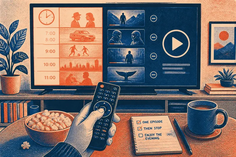
The Recommendation Row Is Not a Neutral Shelf
The recommendation row can steer what you watch through placement and repetition. Learn to spot its cues and choose with a clearer intention.
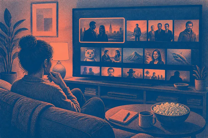
The common mistake with a recommendation row is treating its first title as the natural next choice. That can cost the small amount of attention needed to decide what you actually want: a familiar comfort watch, a short episode, or something entirely different. The recommendation row is an arrangement, not a neutral shelf.
Order makes an argument
A row gives every title a position before you have chosen one. The first card sits under your eyes; later cards require a sideways glance or a scroll. Even if the interface offers no explanation for the order, placement makes some options easier to notice than others.
This does not mean a service has a single, legible intention behind every placement. Rows can reflect viewing history, current selections, editorial collections or other signals, and their logic may be opaque. The useful point is simpler: visibility is part of the recommendation. A title you never see cannot compete for your attention.
Look at the screen as a composition. Note which row appears first, which card is enlarged or highlighted, and whether the page opens on a personalised section or a broad category. These details shape the choice before you have read a synopsis.
Grouping changes meaning
Titles placed together borrow context from one another. A film beside a familiar series may seem like an easy continuation of the same mood; an unfamiliar documentary grouped under a label such as “For a quiet night” arrives with a suggested use already attached.
Categories also make editorial claims, even when the label is vague. “Because you watched” points towards similarity; “Trending” points towards social attention; “Continue watching” points towards an unfinished obligation. Those are different invitations, not interchangeable descriptions of a title.
Grouping can help when it reduces a large catalogue to a relevant set. It can also narrow the field. If every visible option resembles something you recently watched, the row may make repetition feel like the obvious preference, even when you opened the service hoping to change pace.
Repetition builds familiarity
A title can recur across several rows: once in a genre, again in a personalised collection, and later in a prominent banner. Reappearance makes it feel familiar. Familiarity can be mistaken for a reason to choose, although it may only mean that the interface has presented the same option several times.
Visual cues reinforce that effect. A bright thumbnail, a large card, a badge or a brief autoplay preview can draw the eye before you have considered the title’s length, tone or subject. None of these cues tells you whether you will enjoy the programme; they tell you what the interface has made conspicuous.
When the same title keeps returning, pause long enough to ask whether you want it or have simply been reminded of it. That distinction is modest, but it puts the choice back in your hands without requiring a theory of how the platform works.
Name the viewing intention
Before browsing, give the session a plain description. You might want something light while eating, a single episode before bed, or a film that asks for your full attention. A useful intention is specific enough to rule out some options, but not so elaborate that choosing becomes a second activity.
Say you open a service after a tiring day and see a row dominated by tense crime dramas because you recently watched one. If your intention is a gentle comedy, name that first, then leave the personalised row and browse the comedy category or search for a familiar performer. The observable result is that you are comparing titles against your stated mood rather than letting the first row set it for you.
This is not a demand to plan every evening. If you have no preference, browsing without one is perfectly reasonable. Naming an intention is useful when the screen is offering many polished reasons to keep scrolling and none is helping you choose.
What should you notice?
Why is the first row prominent?
The first row is encountered before lower sections and usually needs less effort to scan. Its position can reflect interface design or personalisation, but it is not evidence that its titles are the best match for this particular moment.
Do repeated titles mean they are popular?
Not necessarily. A title may recur because of its category, your viewing history or the way a page is assembled; repetition alone does not explain why it is there.
How can I browse without endless scrolling?
Choose one route, such as a genre, a search term or a saved list, and compare a few candidates there. If none fits, change the route deliberately rather than continuing through rows that keep making the same suggestions.
Should I ignore personalised recommendations?
No. They can be a convenient starting point, especially when you already know the kind of viewing you want. Treat them as proposals to inspect, not instructions to follow.
Read the row, then choose
It is not worth the effort to infer a hidden ranking system from every badge, thumbnail or label. The interface may not disclose enough for that, and speculation can consume more of the evening than the programme would. Notice what is visible and make a decision from there.
The recommendation row is most useful when you can see its cues without mistaking them for your own preference. Name your viewing intention, choose a route that serves it, and let the row offer candidates rather than decide the mood. If your preference changes halfway through browsing, that is a new choice, not a failure to follow the plan.